Writer’s Corner: It’s all in the cover
Posted: July 3, 2023 Filed under: Advertising, Book Covers, Book Promotion, Fiction, Kickstarter, Writer's Corner, Writing 5 Comments
The Shopping Experience
When I was a kid, my mom and my grandmother would pile into the car, and we’d drive to the mall, and we’d spend the afternoon going from one store to the next, carefully making our shopping selections. I remember how my mother would pick up items and carefully examine the packaging to be sure she had the correct item that she wanted or needed, before making the final purchase.
A lot has changed since then. The rise of the internet turned the whole shopping experience upside-down with the birth of online shopping. And then, COVID came along and even those resistant rebels, who enjoyed holding possible purchases in their hands and analyzing the packaging to determine whether or not to buy it were forced to shop online, or go without.
The Cover is the Packaging
As authors, we are faced with similar dilimmas. We write books, and the covers are the packaging. The cover is the first thing a potential reader sees, and if it doesn’t immediately grab their attention, there is a whole slew of other books out there to choose from, and they’re gone. Many readers still enjoy the feel of a physical book in their hands, that will never change, but digital readers judge books by their covers, too, because an image of the cover is the first thing any of us see, whether online or in a brick-and-mortar stores. And just like those in person, physical shoppers who hold and feel the product, read the label, and check out the packaging, readers look over the cover, read the blurb and back cover copy, maybe even take a quick peek inside, before deciding whether or not this book is for them.
When I was listening to the 6 Figure Author podcast with Lindsay Buroker, Joe Lollal, and Andrea Pearson, there was one piece of advice which I heard over and over consistently. If your book isn’t selling look at the cover and the back cover copy first. That is probably where you will find the problem. And they’re right.
We don’t have the space here to talk about the back cover copy. That subject is deserving of a post of its own. In fact, I did last year. If you want to start exploring back cover copy, see my “Review in Practice” here.
What Makes a Good Cover?
More advice given by the 6 Figure Author crew: Go onto Amazon and take a look at the top selling books in your genre. This will give you an idea of what kind of covers are expected in the genre. This is good advice, but what it means, is that a good cover for one genre will not be good for another. As a multi-genre author, this was important to know.
I think a cover should be representative of the story it represents, not only the genre on which the story falls. While a good cover needs to meet genre representation and follow the laws of good cover design, a good cover also contains elements of the story itself in its composition. I’ve developed this belief over time from my own experiences, as I’ve learned to design my own covers. Here is where I add my disclaimer that I am not a professional cover designer. (Of course, when you see my covers, you could probably guess that.) Everything I’ve learned about cover design, I’ve picked up on my own. I’ve had no formal training.
To show you what I mean, let’s take a look at the early covers for Delilah.

Cover 1
This is the cover my publisher wanted to give Delilah. The text is stiff and rigid, but my story is a western adventure with action and movement. I was hoping for something a little more fluid.
Anyone who has read the book would take one look and know that isn’t Delilah. This is a contemporary cowgirl. Note the modern jean jacket and hoop earings.
As covers go, the design isn’t bad, but it does not represent the story inside. As a first time author, I knew I didn’t want to publish my book with this cover, so I hustled to come up with a cover at the last minute.
Cover 2
A friend offered to come up with a cover for me on the fly. What did I want it to look like? I had no idea what I wanted. What should a western cover look like? I gave her some vague instructions. Unsure of what I needed myself. This is the cover she produced for me.
The title is much more fluid and I liked that. It offered a feminine touch that said female protagonist, yet was still bold and active, sort of like my character.
The cover image was vague, possibly due to the vague instructions my friend had been given, and I had several people see it and claim they couldn’t tell what it was. I thought it was obviously a horse, representative of the western genre, and perhaps of Delilah’s horse, which becomes sort of a supporting character in the story.
So, this cover was kind of representative of the story, I liked the text better, and it would do in a pinch. I felt the publisher’s cover to be very misleading, and as a reader I would have been surprised when I found that it didn’t match the story, or more likely, I would never even pick it up because the cover does not represent a historic western, and I don’t read a lot of contemporary.
Cover 3

Eventually, I tried my hand at creating my own cover. This was my first attempt. This cover was representative of the story and it had elements which were actually part of the story. It has both prison gates and a hangman’s noose in the background.
But the text isn’t large enough. Both the title and the author’s name should stand out more. Something I learned from Allyson Langueira of WMG Publishing was that you should be able to read the title and author name in a thumbnail. It’s got to look good small. So my text definitely needed to be bigger.
The sillohuette stood out too much in the black & white version, so I added that putrid yellow, thinking of sunlight, just to give it some color. And my sillohuette isn’t doing much of anything. Better, but not great.
I will say my publisher was pretty gracious about switching covers for me. This was the third cover switch for this book, but it wasn’t selling, and the cover was the only thing I had control over that might help. This cover was better than the covers Delilah had had so far, but I had to admit it was not the ideal cover for the book.
We were coming to the end of my five year contract with the publisher, and Delilah had not done well in the sales department. I decided not to renew my contract, as I felt I could do better with it myself. Although the publisher claimed to have done promos, I never saw them. If Delilah was going to do well, I was going to have to promote it myself.
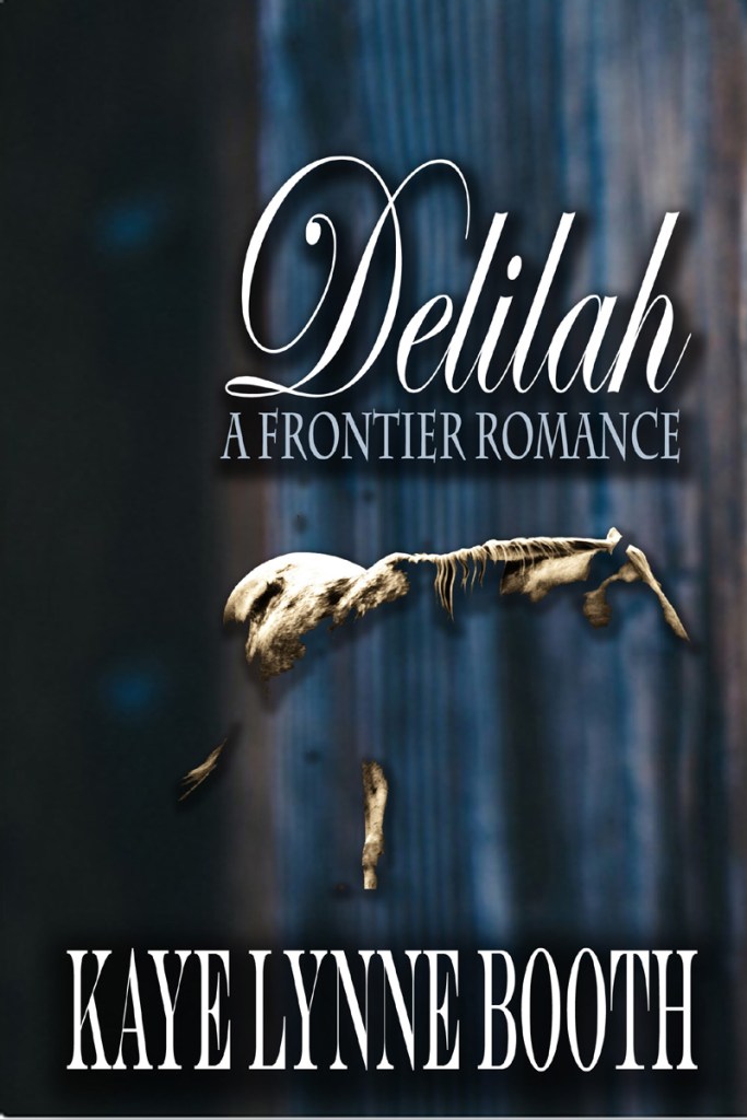
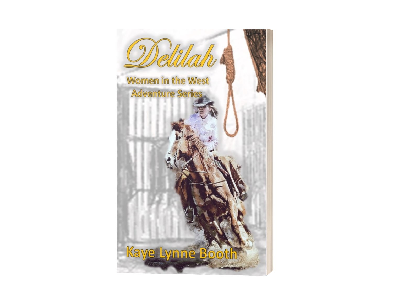
Final Cover

Almost a year later, a revised Delilah, closer to the original I had intended, was released as a part of the Women in the West adventure series. This is the cover I designed for the re-released edition.
The fluidity of the text and the illusion of a moving horse indicate movement. This Delilah is not stagnant, but on the move. She busting out of those prison gates and moving away from that noose fast. In this way, the cover almost tells a summary of the story for me.
The bars have been faded back in this version, so the cover doesn’t look too busy. The woman looks a little bit like a contemporary cowgirl, but not as much as the publisher’s cover did.
Was it the Cover?
In January, I ran a Kickstarter campaign for Delilah and the Women in the West adventure series, which funded, so apparently, I do have a few die hard fans and/or friends out there. During that thirty-day campaign, I sold more copies of Delilah than my publisher managed to do over the period of my five year contract. That doesn’t count copies that sold after the release through distributors, as a result of the book blog tour and other promotinal efforts. It’s not like Delilah became an overnight bestseller, but I do find it curious that in only a few months, this edition of the book has outsold what all of the others did across a five year period. There are other things that could have been the cause of these results, like the new back cover copy, or my extended promotional efforts. So, was it the cover? What do you think?
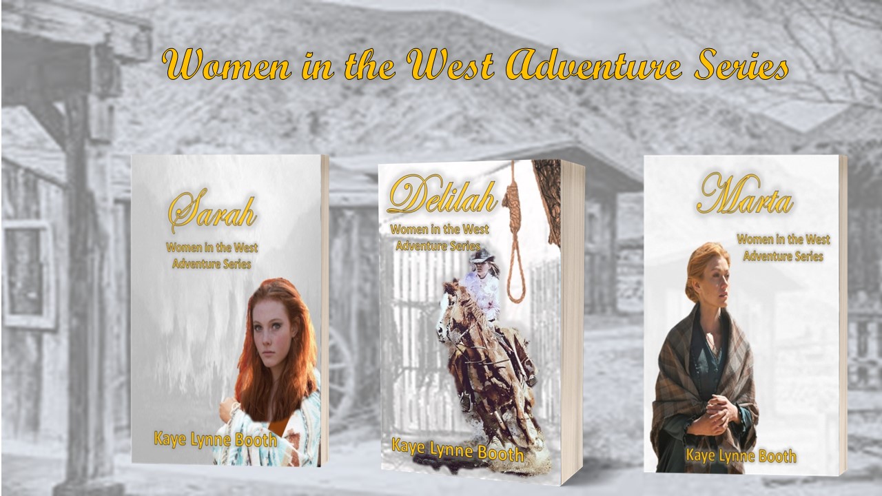
Covers for the Series
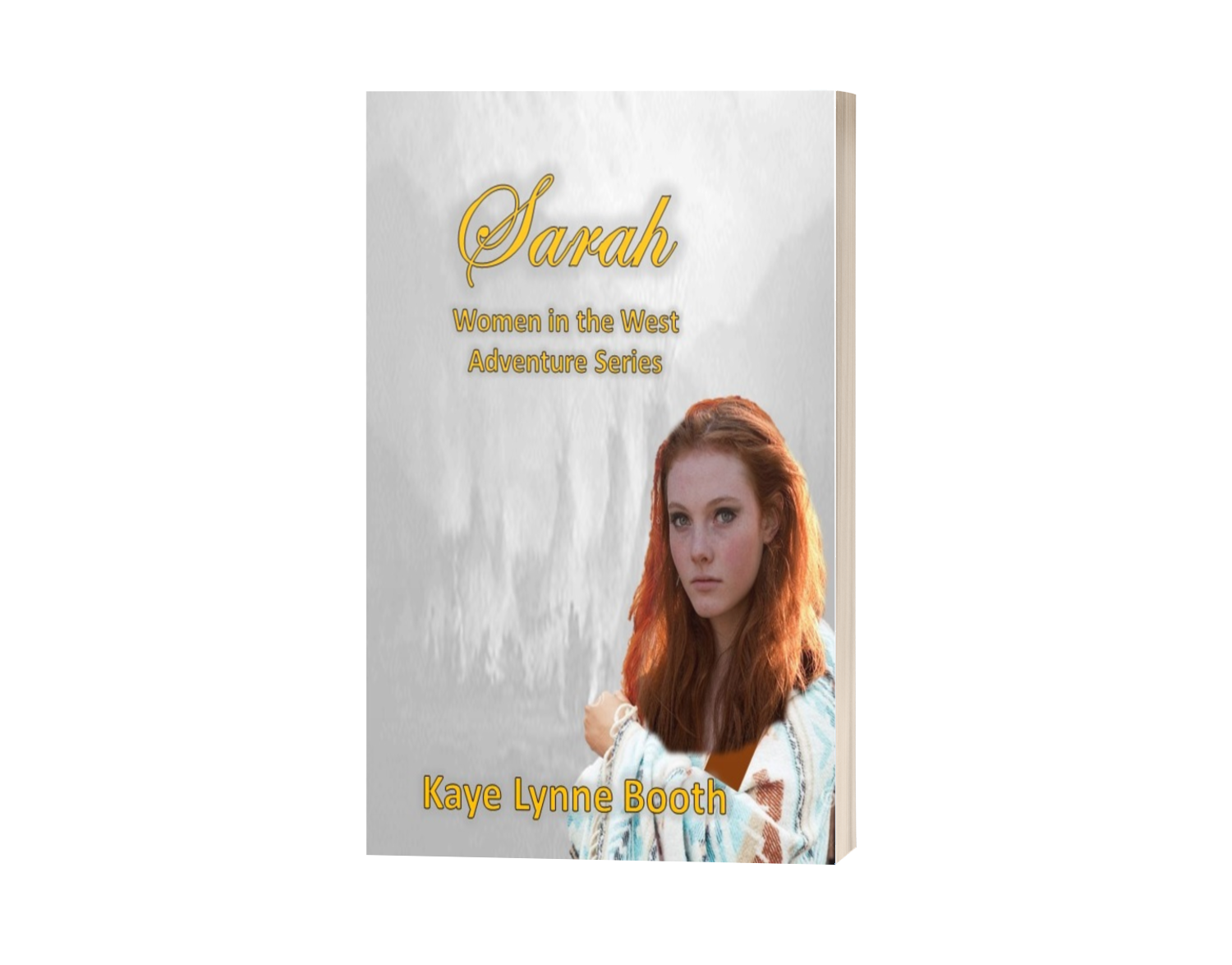
At the time when the Kickstarter ran, I had been playing with the cover for Sarah a little bit, but I had to throw together a cover for the third book, Marta; a story for which I only had a vague concept for, so I only had a very rough draft of a cover to display for the Kickstarter campaign.


I said that part of the money raised in the Kickstarter, would go to redesign the covers for the series. I had two different cover designers, who both stepped down due to personal issues, but I found a cover designer friend who was willing to offer some pointers, so I ended up redesigning them myself. Here is the final result. I think you’ll agree that these covers are much better and I feel that they feel like they go together, and each seems to represent the series brand.
A Word of Thanks
The timing for this post is syncronistic, for as it posts Delilah has been nominated in the 2023 Connections eMagazine’s Reader’s Choice Awards! It looks like Delilah has finished in the top 10 with 85 votes. Considering the contest began on July 25th, and I didn’t find out Delilah had been nominated until the 29th to try and rally support, I think that’s pretty good. I want to thank all of you who did your part and voted for Delilah, some of you several times, since you clould cast your vote once a day. I also want to thank whoever it was that nominated my book. This was the first time I’d ever been involved in such a contest, and it was very exciting, so my thanks for this are huge. I don’t know who you are, but I love you.
______________________________________________________________
For Kaye Lynne Booth, writing is a passion. Kaye Lynne is an author with published short fiction and poetry, both online and in print, including her short story collection, Last Call and Other Short Fiction; and her paranormal mystery novella, Hidden Secrets; and book 1 of her Women in the West adventure series, Delilah. Kaye holds a dual M.F.A. degree in Creative Writing with emphasis in genre fiction and screenwriting, and an M.A. in publishing. Kaye Lynne is the founder of WordCrafter Quality Writing & Author Services and WordCrafter Press. She also maintains an authors’ blog and website, Writing to be Read, where she publishes content of interest in the literary world.
_______________________________________________________
Want exclusive content? Join Kaye Lynne Booth & WordCrafter Press Readers’ Group for WordCrafter Press book & event news, including the awesome releases of author Kaye Lynne Booth. She won’t flood your inbox, she NEVER sells her list, and you might get a freebie occasionally. Get a free digital copy of her short story collection, Last Call and Other Short Fiction, just for joining.
Discover more from Writing to be Read
Subscribe to get the latest posts sent to your email.


Hi Kaye, the covers of your series are all good. I don’t buy books based on covers but an amateur looking cover would be a turn off
LikeLiked by 1 person
I like it when you can look at the cover and have some idea of the story inside. ☺️
LikeLiked by 1 person
Yes, I think a lot of people are strongly influenced by covers and blurbs.
LikeLiked by 1 person
Interesting history of your covers, Kaye. I like the themed approach for the Women of the West.
LikeLiked by 1 person
Thanks Jacqui. I was hoping it would be found of interest. I like the approach as well. Creating a themed series also offers direction as to what the next story will be. 🙂
LikeLiked by 1 person